Looking at paintings, wrongly
How a bad photo (mine) made me rethink what paintings are

This post is free. Some of the others aren’t. Please consider subscribing, paid or unpaid. The button is below.
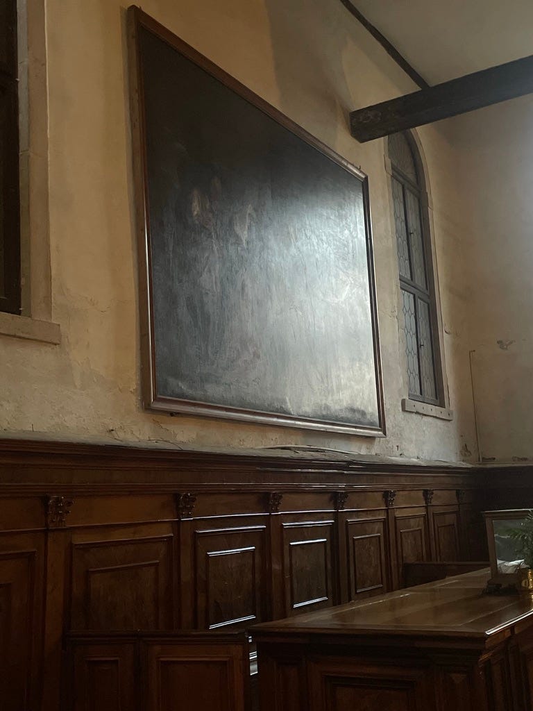
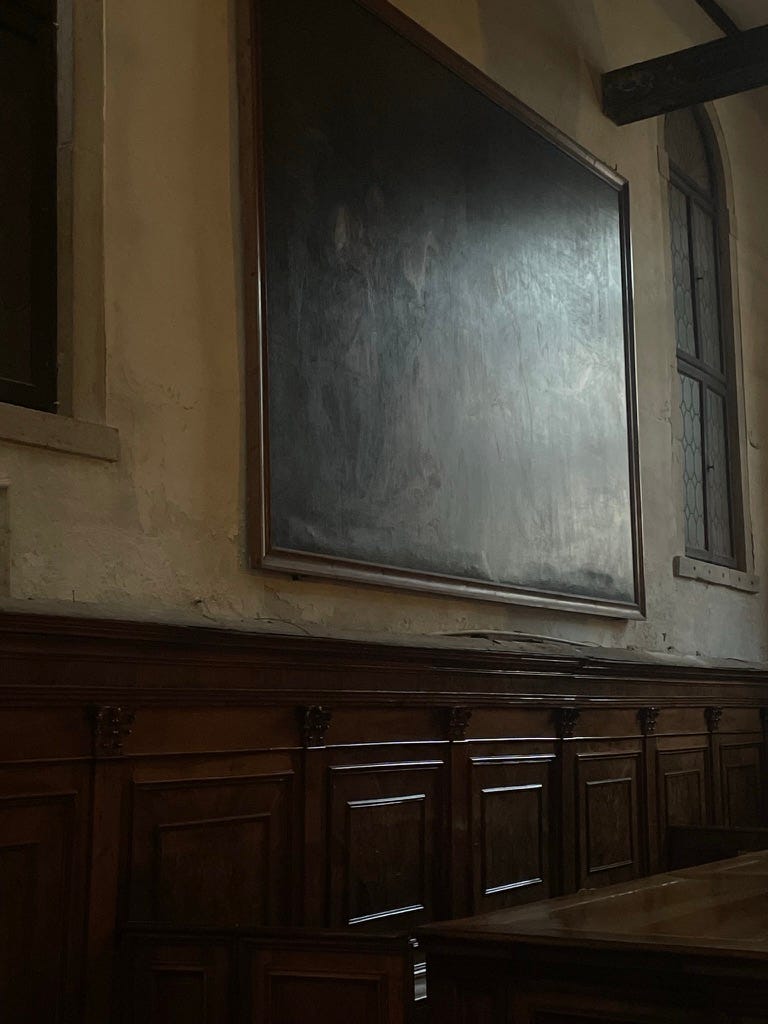
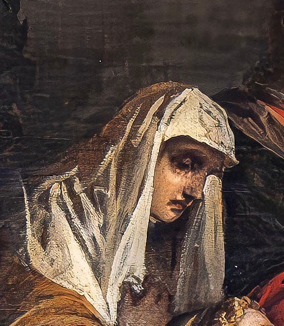
The photograph above was taken about a year ago one afternoon in a church in Venice.
Just to be clear right from the beginning, I don’t think it’s a great photo. Not remotely. You can’t see anything, for one. You can’t see what you’re supposed to be looking at. Which is a very large, framed painting.
But when I was there, the setting sun lit up the canvas from the clear west windows of the church in a way that not only stopped me in my tracks at the time - worth getting my phone out for - but has stayed in my head ever since. I keep thinking about it. I’m writing this to find out why, I suppose.
The first answer is that I took the photo in order to capture that particular fall of light on the canvas. As you can see, the light more or less obliterates the image. Almost none of it is visible. If you’re not looking too closely at the photo, it could be a blackboard, or a huge TV screen, or a sheet of glass, or a mirror.
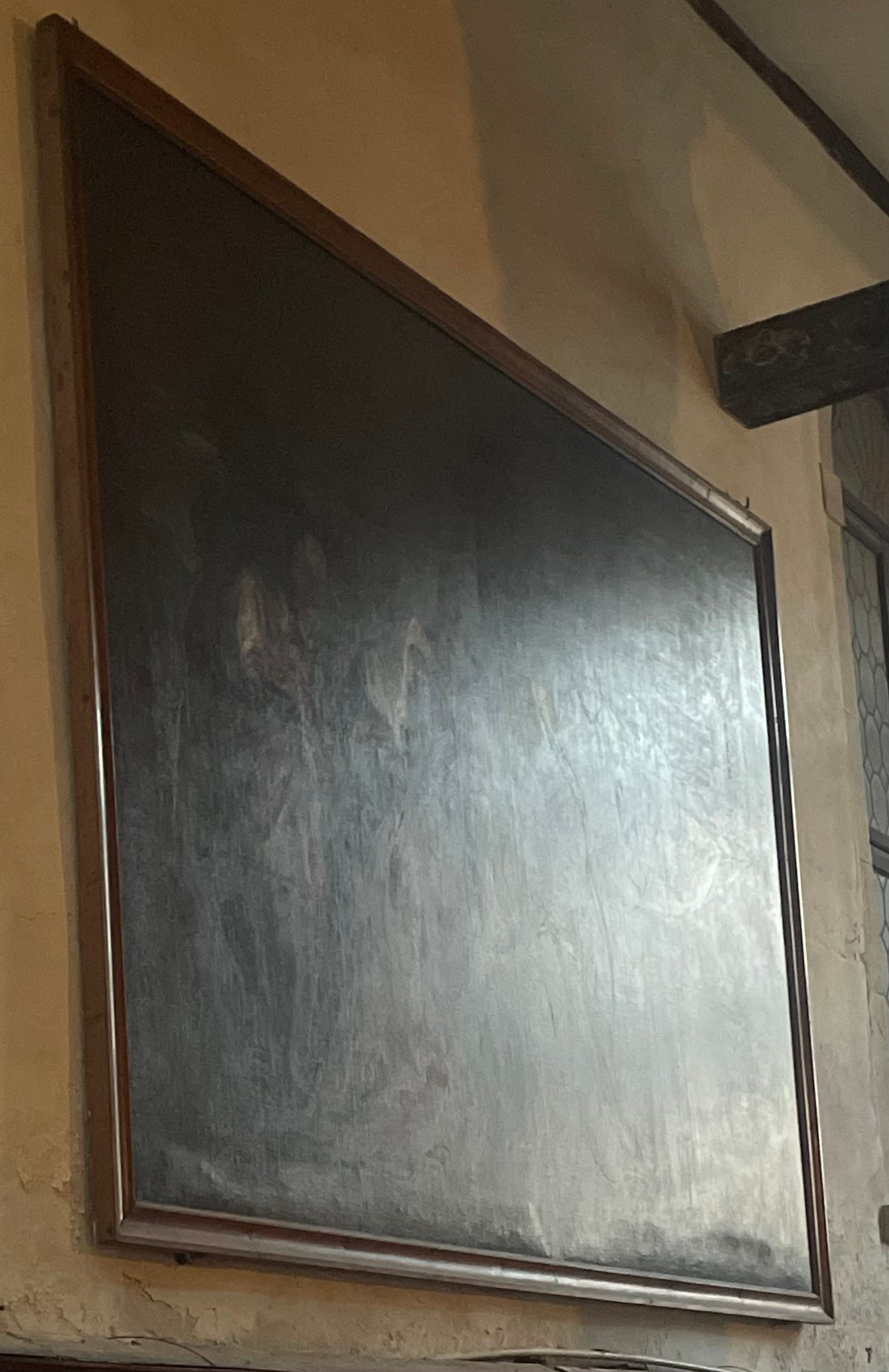
What made me take this terrible photo? It was something the light allowed me to experience: the physical properties of the thing itself, let’s say. See how the fall of light picks up the inconsistencies of the canvas’s surface – the places, that is, where paint has been applied to create the illusion of actual bodies in actual space.
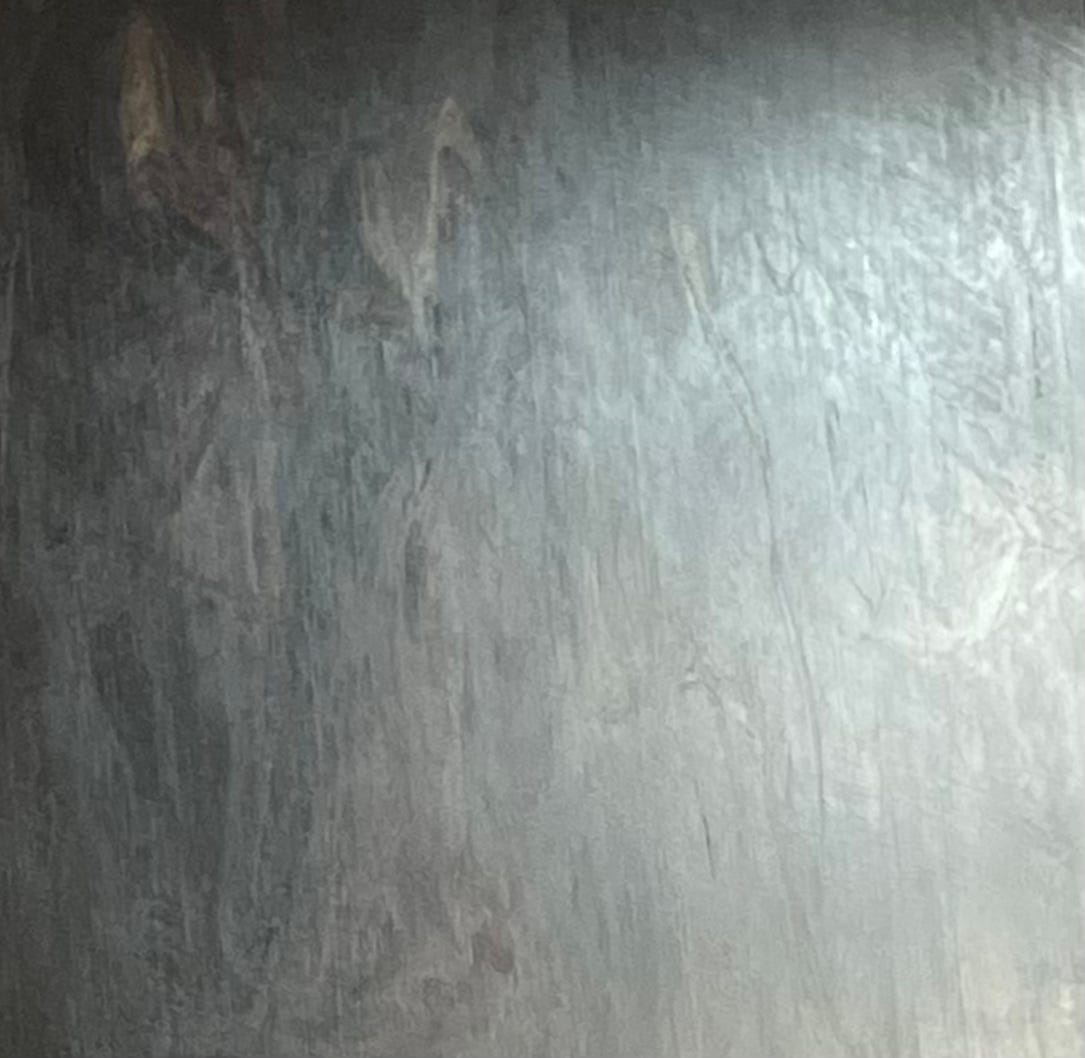
Look closer and the light also shows something of the hidden texture of the canvas itself: the surface that becomes submerged in the act of applying colour to a fabric. The use of canvas for painting - it was made on the same looms sails were - makes sense in a seafaring culture like Venice’s, but it also has you reaching for watery metaphors when thinking about the art made there. The sail sinking beneath the waves. I’ll stop.
I think I can see – and this is where I wish I’d taken more photos of this – the shipwreck beneath the skin of the painting. Not shipwreck: skeleton. That is, the wooden stretcher around which the painting, which may have been sewn together from multiple smaller canvases, is – well, stretched. I think I can see how that surface would feel if you were to tap on it with the tips of your fingers. Like an old tambourine, with its slightly loose skin. (There was always one in any school music lesson, unusable). Or a snare drum with a slack surface, before you tighten the screws. I think I can see, as my imaginary fingers tap, the canvas slightly undulate and wobble in the light. I can also see how, were I to press hard with a single finger, I might be able to punch a hole right through and touch the wall behind.

What made me take this photo was that that moment – towards sundown, one cold February in Venice, probably a little over-caffeinated – granted me a lesson in the ongoing, never-ending journey of coming to understand what paintings are and what they do. Which is in some ways the function of this Substack, but also the other work that occupies my days before the school run: teaching, writing, lecturing. I want to find a way to talk about these things without suppressing or ignoring the sense data that accompanies the experience of looking.
That’s to say, more clearly: what else is happening as we look at an artwork, and how does that supposedly extraneous information affect our encounters with the thing we see?
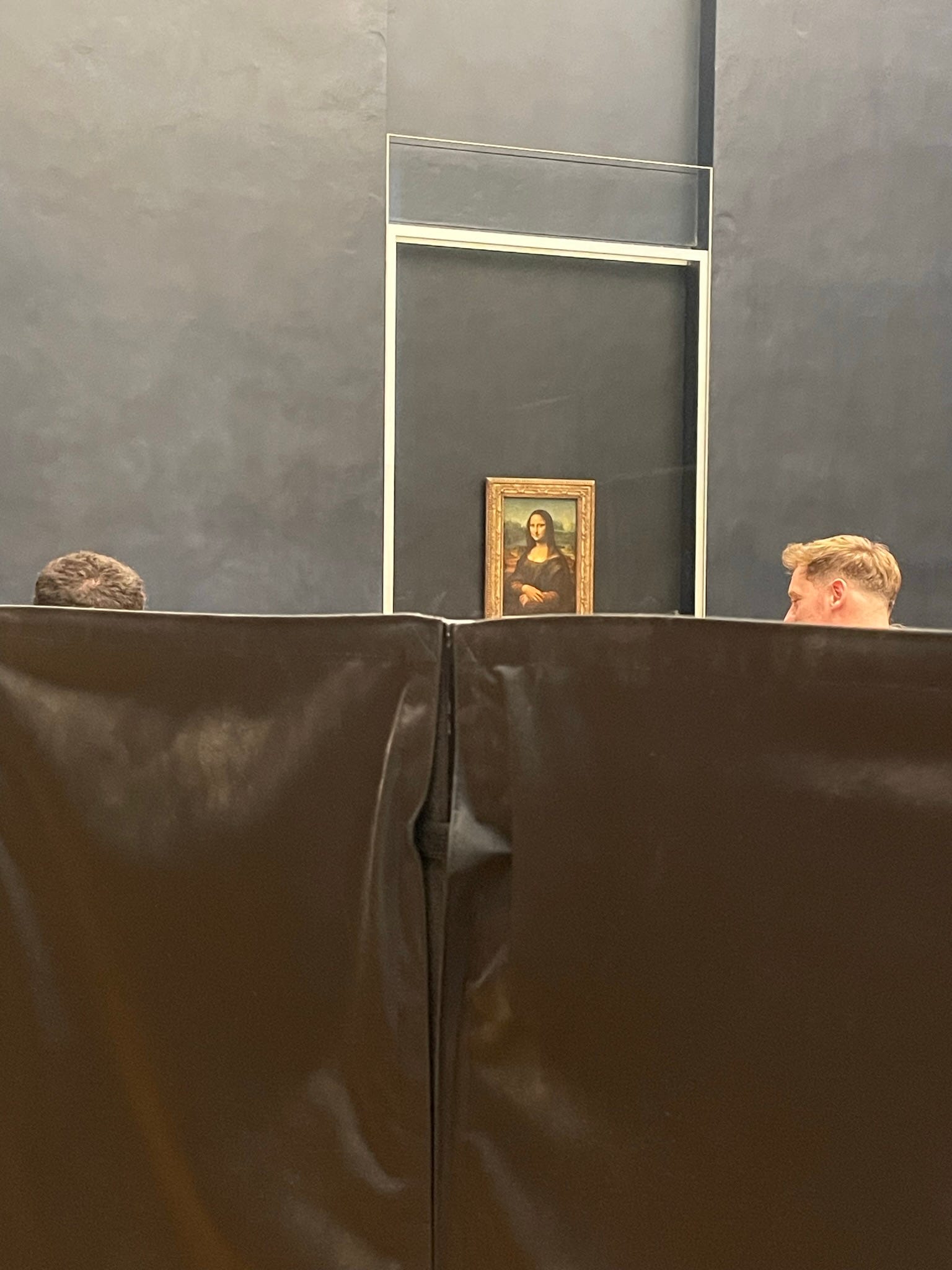
How, for instance, can we think about the effect of being surrounded by other bodies as we try and look at a very famous object? Or the acoustics of the gallery we’re in?
I’m pondering these questions really as a way of keeping in view what makes visual art unique in the field of culture, which is that it is, unlike almost everything else, the only one of its kind. (Yes: photographs, prints, replicas and so on, but, the previous and following sentence notwithstanding, all of the rest of this applies to them too). And if a thing is the only one of its kind, I think we are obliged to pay very close attention to it, in honour of its uniqueness and our own.
Here’s what I mean. This is what the obscured painting of that Venetian afternoon actually looks like.
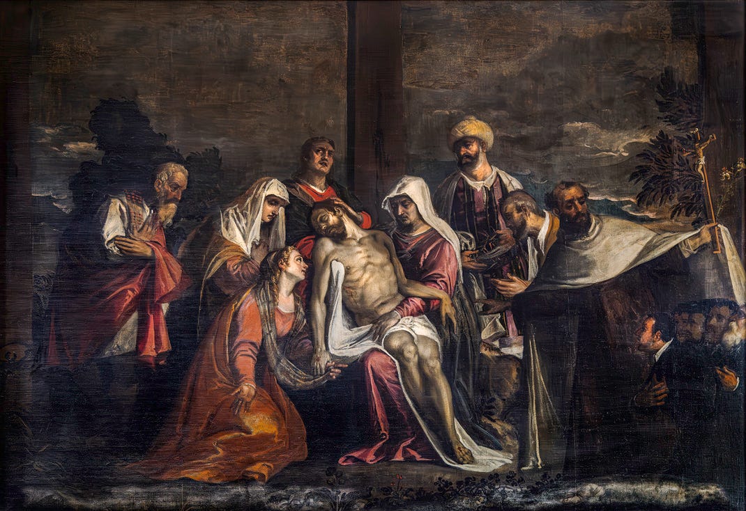
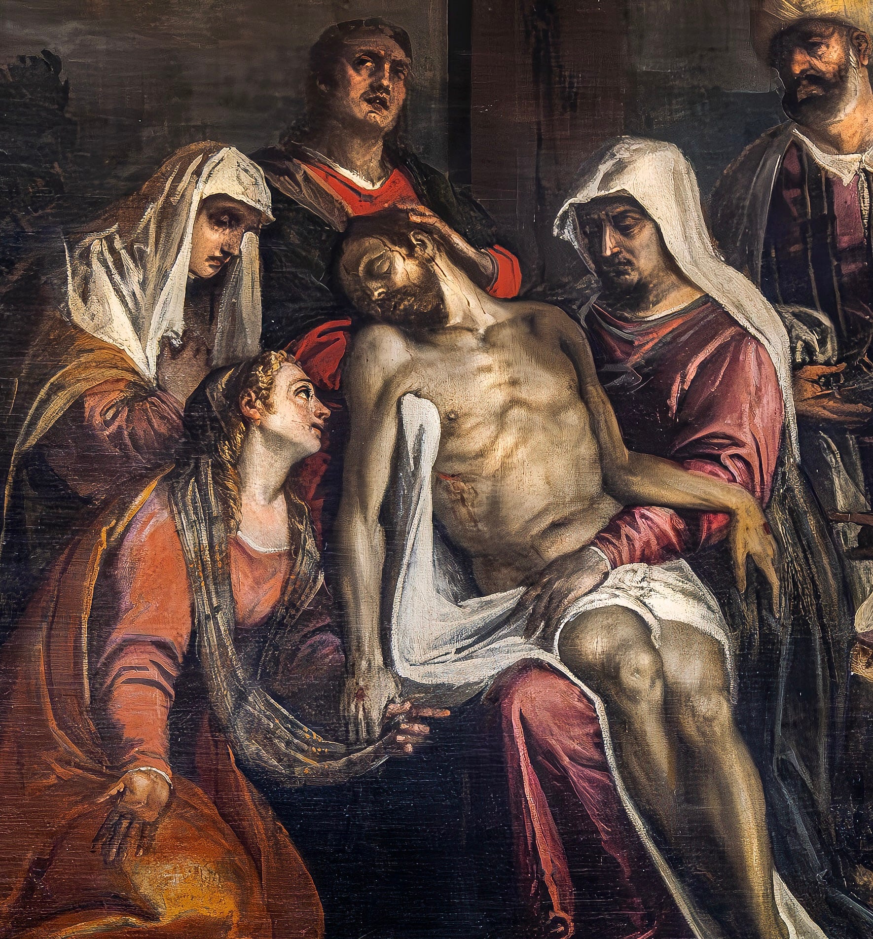
Christ lies dead in his mother’s lap; mourners, many of whom are identifiable by name, surround them; and beyond them, in a series of concentric circles of diminishing theological importance, are other, smaller figures, possibly the guys who paid for the painting to be made in the first place, and with that, the painting’s content more or less snaps shut.
I don’t think it’s a great painting. It’s like a lot of other paintings made at the time – which, I guess, is the late 16th, early 17th century? We don’t know the name of the artist (or I haven’t been able to find it anywhere; it looks like a bootleg Tintoretto to me). The fact we don’t know the name of the artist might reflect the painting’s middling quality. It might suggest that no scholar has been fired up enough by the work to do the necessary research to identify the maker.
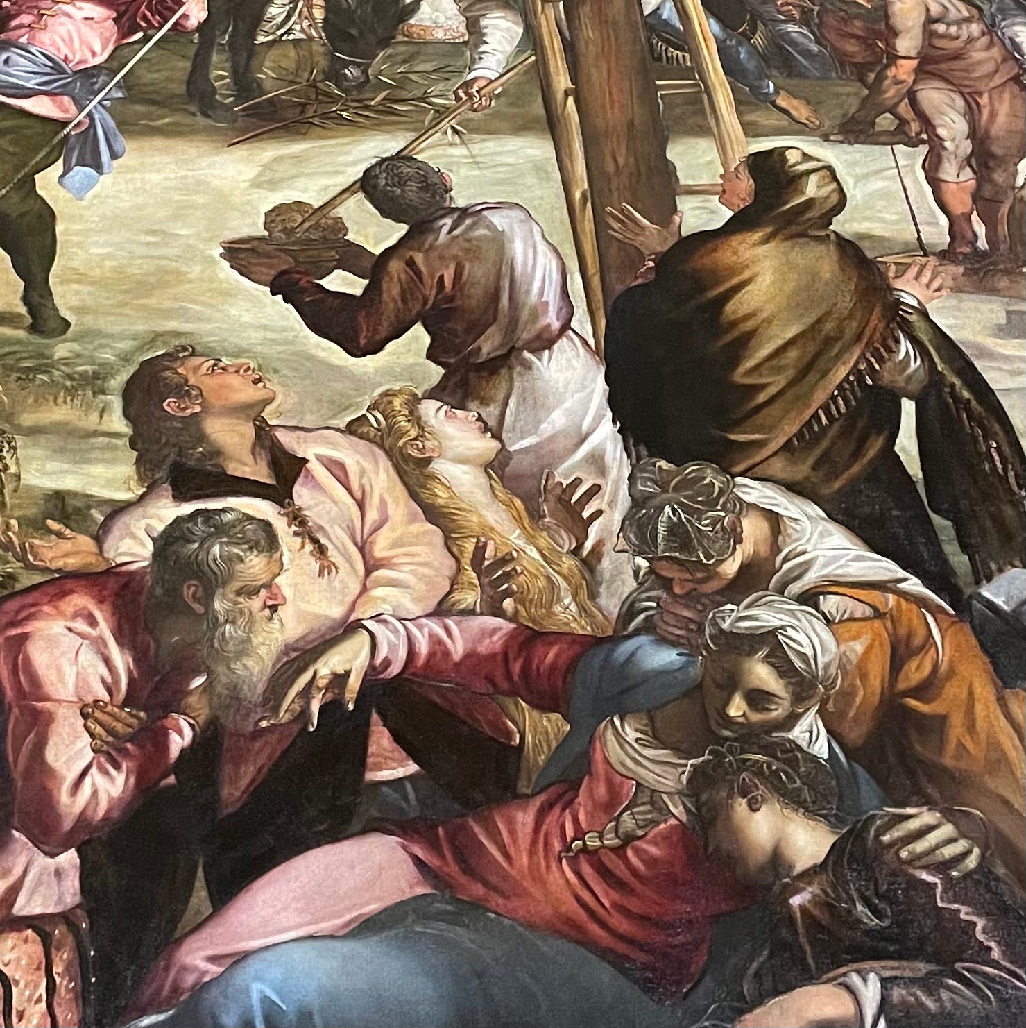
When I say “middling”, what I’m trying to nail down is the painting’s quality according to what I imagine the critical criteria of the day might have been, based on the paintings from the time that do have an identified author, and probably hang in museums, with tasteful lighting and a new frame and wall labels and even a bench in front of them. Compared to, say, Tintoretto, the depiction of extreme grief here looks a bit flat: compare the image of Mary Magdalene here, who’s the one in orange to the left of Christ, with the same figure in Tintoretto’s Crucifixion.
This one looks a little bored, listlessly rolling her eyes; Tintoretto’s is in the throes of abject grief, her eyes red with tears. This one falls short when it comes to emotional believability. Possibly anatomical believability too: Christ’s thighs look too short, for example. By what I think of as the standards of the time, these look like failures. By the standards of art resembling human life, then, it doesn’t quite make it. If you imagine those thighs are real thighs, in other words, they don’t look much like thighs.
But here’s the real question. Which of these two images is the “real” painting?
The image I just discussed above – which helped me conclude that it isn’t a great painting, something I’d never be able to assert in the church – isn’t what you see in the church, even when the light is less slanted, even when you’re standing face-on to it. For one, you see it from below, meaning that the shape of the canvas is much more like a trapezoid than a rectangle, at least as we perceive it. This image is clearly taken face on, as though by someone on a cherry-picker, or with wings, or suspended on a wire from the ceiling. That’s not how we see it. (Unless, etc). Also, the painting has been carefully lit, probably by multiple electric lights, in order for the photo to be taken. Again, this is not how we see it.
The light in the church is varied. There are electric lights here and there. Natural light from the windows, which changes dramatically over the course of the day, as well as the year. Moonlight, sometimes. And, of course, the inconsistent, indeterminate, flickering light of candles. What this means is that this image you’re seeing is (1) not what you see in the church, and (2) not one the artist ever saw, and (3) not one anyone in the church ever saw, up until let’s say the very end of the twentieth century – by which time the artist and his/her intended audience, and their children, and their great-grandchildren, were all long dead.
So, the image you can “read” – checking off Christ, Mary, cross, patrons – is one you will never actually get in reality. All this talk of “middling” quality, then – I mean, what was that all about? And – further – when we look at works of art of the past, are we seeing what we think we’re seeing?
The reason I took this bad photo is because it set in motion, in my head, this series of thoughts that I think are worth thinking. It can be boiled down into a question. How do we take into account that artworks, unlike books or films or recorded songs, exist in time? That they warp, rust, crumble, break, fade, melt, shatter, splinter, crack, smash, decay, deteriorate? That they change when the light does? That they change when we move, when we’re alone, when we’re in a crowd? When the lights are off?
Could we see them not as fixed things, vacuum-sealed in one single ideal manifestation - as they appear on the pages of art books, the projections in the art lecture, the screen of the phone or the laptop - but as things that live in some way as we do? As vibrant things subject to the actions of change? As alive?
The painting is in the church of Santa Maria dei Carmini in Venice. It’s one of the best places in the city to see old art as it’s meant to be seen - in situ, within an active local church. There’s an excellent Lorenzo Lotto in there of St Nicholas as an old ham. Free to get in but bring coins to light up the paintings.